UI App and Visual Components
Introduction
Hello fellow Olympians 👋
This is the name we call each other users of Olympe, and you are now a little bit in the team 🍻 😉
Remember the Great Triad of an App?
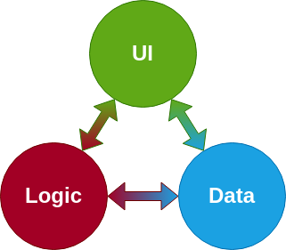
Last chapter we discovered the Logic part of it, in this chapter we will discuss the UI side!
Do you recall the Hello World! app we built in the Hello my First App chapter? I told what to do without really explaining anything. But now it is the time to make everything clearer 😉
We will create a new application during this chapter, a simple one but still a bit more complex than the Hello World! one. We will see what is an UI App and the Visual Components in it, and we will even add interactions with the user alongside with multiscreens navigation! You can find the final app we will build in this chapter here.
Sounds good? Jump in and let me drive you through 🚐
At the beginning there was an UI App
Okay! As for any new little application we need something to contain it.
It can be a new Project or just a new Folder, in my case I will reuse my folder My Exercises.
The organization in DRAW is something quite personnal. There are of course some common good practices, especially useful for bigger projects, but since we are just messing around for now, feel free to explore what you prefer 😉
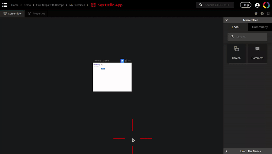
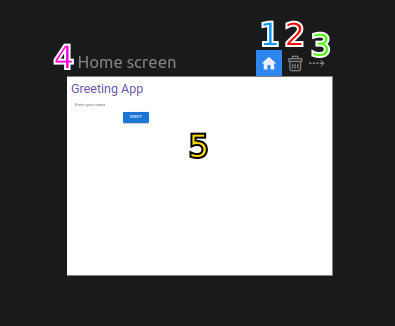
Next you can create a new UI App from the Marketplace, call it Say Hello App and enter it, you should see this:

It should not be a surprise anymore, since we entered a UI App brick, then we are now in the UI App Editor:
- This editor is composed of two tabs: Screenflow Tab and Properties Tab.
- We already saw the last two buttons (Run and QRCode), the first one is for debugging the application and we will see that in more advanced chapters.
- The Screenflow Tab has its own Marketplace, the main brick available is Screen.
- The Screenflow Tab main area, we will see how to use it later in this chapter 😉
- This white rectangle represents a Screen and is called Home screen. A UI App always has at least one screen.
But what is an UI App exactly?
Basically it is the entry point of a visual application. For now let's continue with this, it will be clearer once we will see the Screenflow later in the chapter 😉
For now all that interest us is this Home screen. You can run the app in a new tab (the second button in the 3. area) and enter the Home screen.
Before we start building the screen, what will our little example application do?
Do you remeber the Say Hello brick we built in the last chapter? This app will do the same, however not only in DRAW but in a real application 💪 Quite simple I agree, but it will allow us to see very useful new concepts!
In the UI App there was a Screen
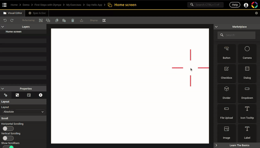
After entering the Home screen this is what we see:

Riddle time! We just entered a Screen, what is the name of the editor?
- This editor is composed of two tabs:
- The Visual Editor Tab.. a bit of a strange name.. let's call it Visual Tab for simplicity 😁 It is the main tab for everything UI-related in DRAW and probably the most complex one too. We will break it down in this chapter and in the next one!
- As for the Function we built in the last chapter, a Screen also has the Spec&Doc Tab. Its purpose is the same, however with a little twist: we don't use inputs and outputs here but properties. We will see that in due time too.
- As for the Logic Tab, the Visual Tab has a toolbar with cool stuffs in it (undo/redo, copy/paste, grouping), we will use them in the next chapter.
- The Marketplace contains Visual Components this time. We can do a comparison with the Logic Tab here too: a Function is composed of other Functions, here a Screen is composed of Visual Components.
- This is the Layers panel, it will list the components in our screen for easy access. We will see that too.
- This is the Properties panel, certainly the most important one. It is here that we will modify and tweak our Visual Components to look how we want and do what we want!
- Finally this in the main area of the tab. Where we will add Visual Components from the Marketplace and preview how the screen will look like 😉
Now that the presentation is done, let's start building!
In the Screen there was a Label
To start things off, when I build an application I like to begin with its title.
As said before a Screen is composed of Visual Components. A Visual Component is a brick that shows something on the screen. One of the simplest component is called Label, this component shows text on the screen. And that's exactly what we need for our title 😃
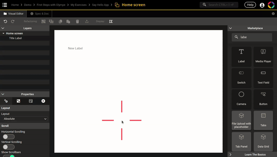
I let you follow this gif to create the title Label:
Notice how the Label also appears in the Layers panel with the name New Label. The Layers panel allows us to rename it, it is not mandatory but I can assure you that it will help us a lot later on. So check the gif to also rename the Label to Title Label 😉
As for anything in DRAW the naming is up to you. By convention for Visual Components in a Screen I use the form <purpose> <type>. For our Label the type is.. well.. Label, and the purpose of it is to show the title, so the final name is Title Label.
What we just did is the basic process to create any Visual Component:
- Search for it in the Marketplace
- Drag-n-drop it in the main area
- Rename it in the Layers panel
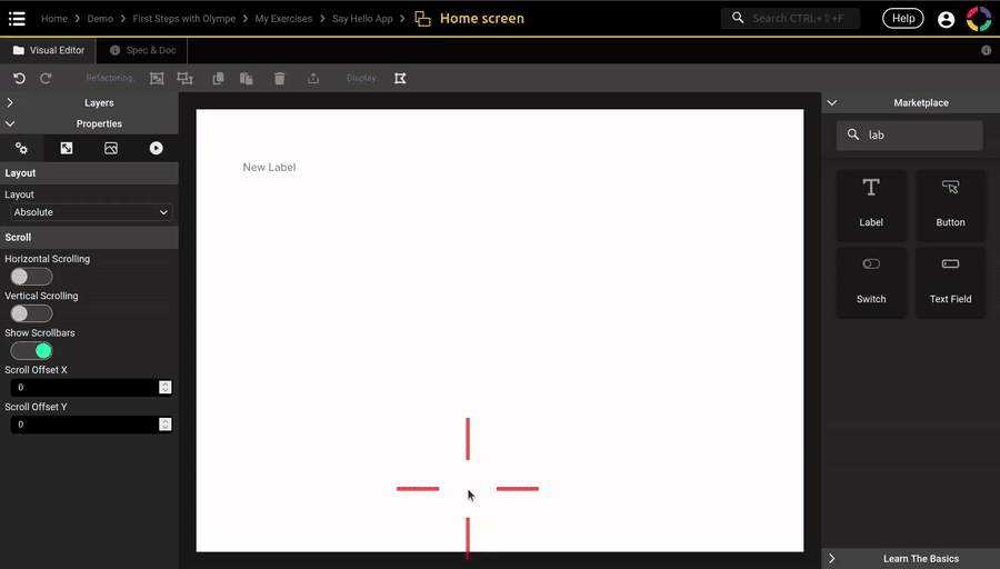
Notice also the blue frame around the Label, it tells us that the Label is currently selected. You can select a component by clicking on it in the main area or in the Layers panel. On the contrary if you click anywhere else, it will select the Home screen directly. This gif shows those two methods:
The Properties Panel
We have our title label now, but how to change its text, style and color?
All those are what we call properties of the label. Each Visual Component has its own set of properties that allow us to customize the component. In the case of a Label it can be the text, the font to use, the color of the text, and so on.
This is where the Properties panel enters the scene. As its name would suggest, it shows the properties of the currently selected component in the screen. So start by selecting the title label and let's have a look:

The properties are organized in tabs, there are four of them:
- Specific properties: those are the properties specific to the component itself, in our case all label-related properties are in this tab.
- Position & Size properties: those are properties that are common to all components, and they are related to positionning and sizing.
- Visual properties: those are also common properties of visual components.
- Interactions: those are not properties but events, we will see that later on.
In each tab you have then a list of properties, let's talk about a property alone:
- It has a name to help us recognize it, like an IO in a logic case.
- It has a value, the value depends on the type of the property.
- The value can be constant if you set it directly, or dynamic if you use the little Fx button.
As you may have realized, a property is actually very close to an input: it has a name, a type and a value (constant or dynamic).
And you would be right to think so, we can see properties as inputs of a Visual Component, and the output is what the component shows on the screen 😉 It is actually a bit more complex than that but if it helps you to think like this, don't hesitate to do so!
It is cool to see the property name and value, but how do we know which type it is?
That's a fair question, and the response is: in the doc!
This gif shows you how to have the doc of a single property and for the Label entirely:

On the blue frame around the selected Label, you can also show the full doc from there with the little ℹ️ icon button.
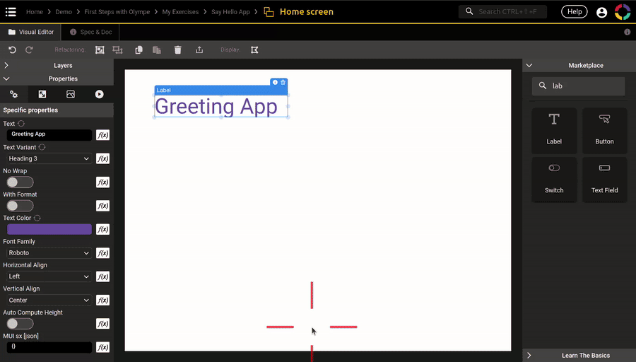
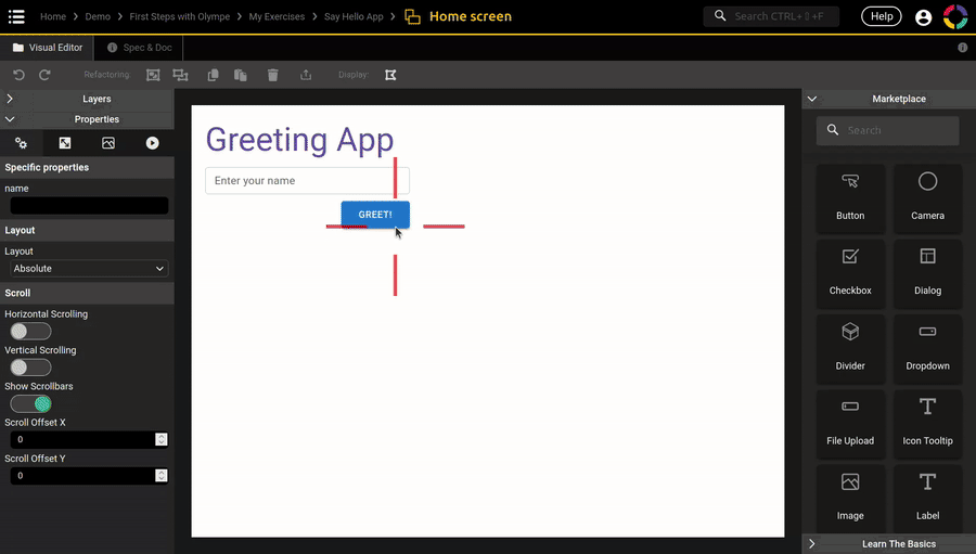
Okay now that we know a little more about the Properties panel, let's use it shall we?
The gif below shows you the whole process, but you can try to do it by yourself first 😉
- Change the Text property to
"Greeting App" - Change the Text Variant property to
Heading 3 - Change the Text Color property to any color you like 🎨
The gif also shows you something very interesting and useful when building a screen with DRAW: you can switch between your DRAW tab and your running application tab, and everything refreshes live! If you have a big enough display (or two displays) you can even put them side by side 😉
This real-time feature of DRAW is almost everywhere in Olympe, so don't hesitate to use it to check instantly if what you are doing in DRAW is what you want in the running application!
If the real-time doesn't seem to work, refresh your tabs. This doesn't happen often but ,depending on the browser policies and the network state, the tabs may be disconnected.
Positioning and Sizing
Now that our title looks quite good, let's put it in the right position.
The properties related to positioning and sizing are in the second properties tab:
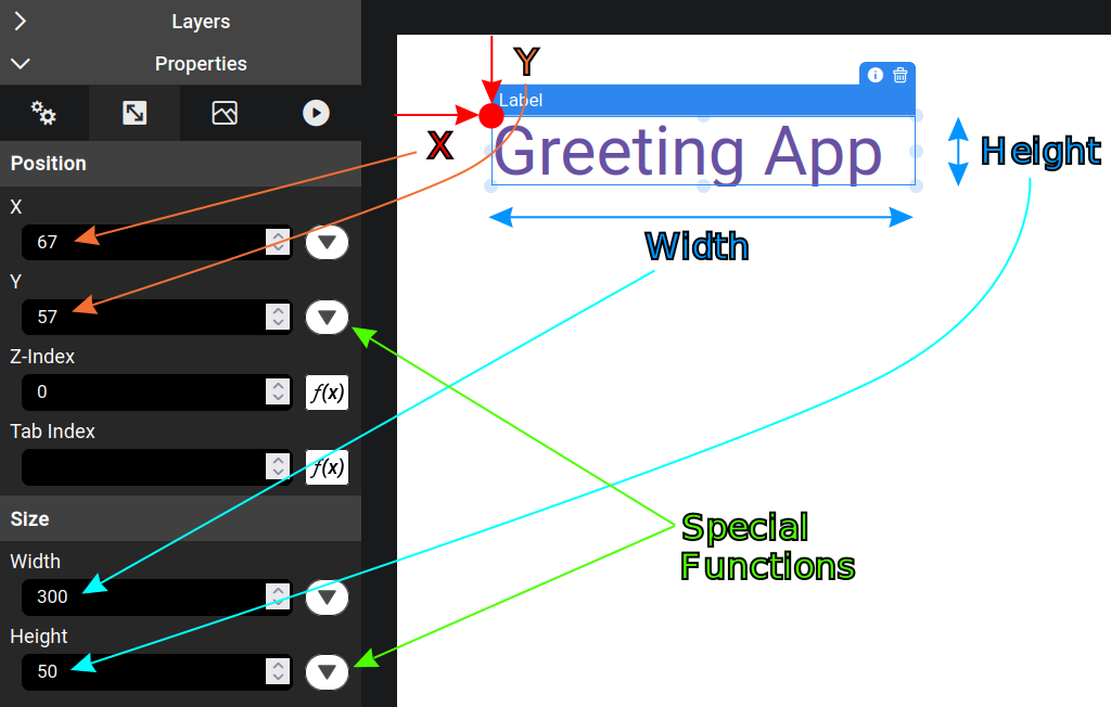
Those four properties are all of the type Number, and their value are as follow:
- X: the number of pixel between the left side of the screen and the left side of the component.
- Y: the number of pixel between the top side of the screen and the top side of the component.
- Width: the width of the component, in pixel.
- Height: the height of the component, in pixel.
- For some of those properties you can use special functions and not only the Fx button. We will see them in the next chapter.
The position of the component is defined by its X and Y values, together they are the top-left position of the component. It is the red dot in the screenshot above.
The size of the component on the other hand is defined by the Width and Height properties.
There are two ways of changing those values. You can move and resize the component directly in the main area of the Visual Tab, this is useful for quick prototyping and to test things out. Or you can set the value manually directly from the Properties panel, to be more precise:
Notice how you can reset a property to its default value ☝️
To align the title like in the gif, set the values as following:
- X and Y set to
20 - Width set to its default value
- Height set to
60
To quickly switch from one property to the next one, you can use the Tabulation key on your keyboard.
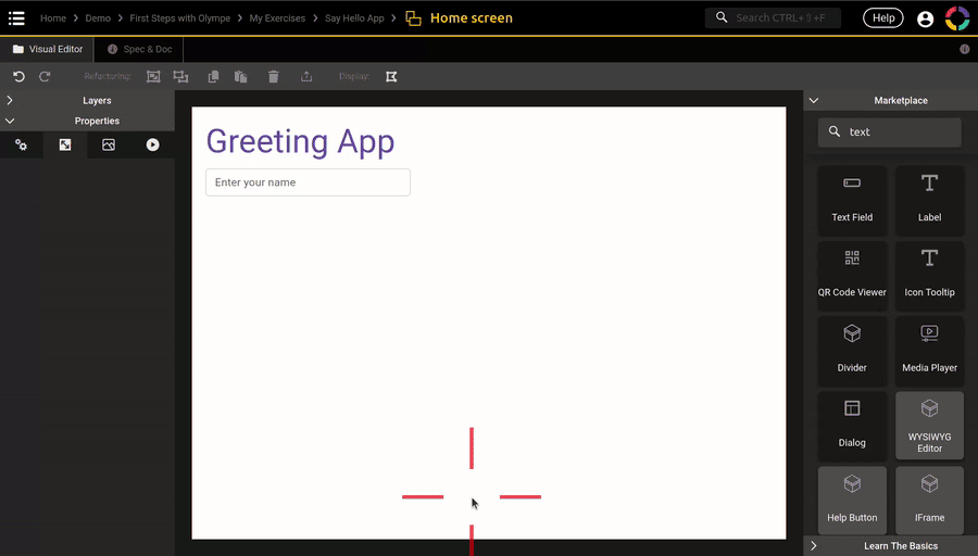
Get user's input with TextFields
For our Say Hello App we need to get the user's name. To get this kind of information one very powerful component is TextField. This component shows a field where the user can typ text. It can do much more than that, but for now we will limit ourself to text only since we need a name. However do not hesitate to play with it 🔧
I let you try to add the TextField by yourself with those values:
- Label (property) set to
"Enter your name" - X set to
20, Y set to90, Width set to300 - The component name should be
"Name TF"(TF is a shorthand for TextField)
Here is the gif that resume the exercise:
Add interactions with Buttons
We have now the name of the user, the last thing missing is a button that he or she can click to finally say hello!
The name of this Visual Component is straightforward: Button
Here is the required values:
- Text set to
"Greet!" - X set to
220, Y set to140, Width set to100 - The component name should be
"Greet Button"
And the related gif:
The skeleton of our screen is now finished! However it doesn't do much yet 😭
We need to add some interactions in it, but before that we need a second screen!
The Screenflow Tab
To add a second screen in our application, we can go back in the UI App Editor in the Screenflow Tab:
You can see how the Home screen content is showing directly in the tile!
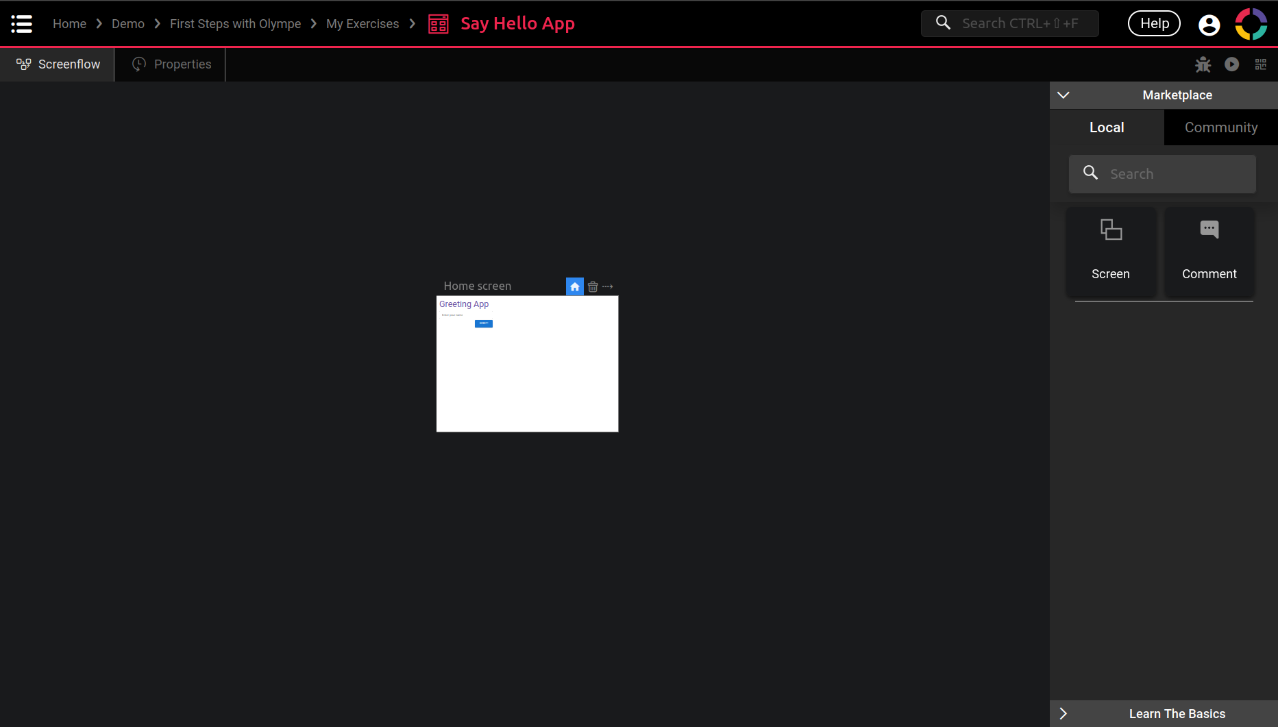
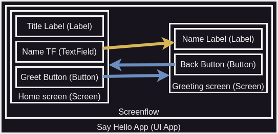
To resume our application with one screen, we can use a schema like this:
Take it from the outermost rectangle to the innermost:
- The app starts with the UI App.
- The main part of a UI App is the Screenflow.
- The Screenflow contains our Screen.
- The Screen contains the three components: Label, TextField and Button.
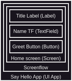
From this single screen application we want a second screen, so the schema would look like this:
And this is what the Screenflow Tab is for! It allows us to create new screens in the UI App.
Another way of seeing this is:
- An UI App contains an hidden Screenflow.
- The Screenflow is for managing the Screens in the application.
- Therefore an UI App is just a collection of screens!
The Screenflow Tab also allows to connect screens between them, creating transitions.
We will see that in a short moment 😉
That's what I want you to remember out of this: a UI App is a collection of Screens, the user arrives on one screen and navigates to other screens. The Screenflow Tab is the editor in DRAW to do all that.
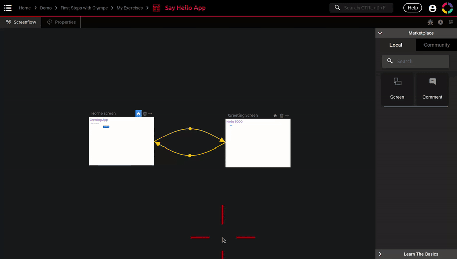
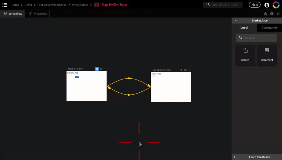
Creating a Second Screen
Let's create our second screen, for that just drag-n-drop the Screen brick from the Marketplace.
Let's call it Greeting screen. In it you can add the following:
- A Label called Name Label, same positioning as the Title Label but the Width is
600. It will contain the name typed in the Name TF of the first screen. - A Button called Back Button. Text is
"Back", Variant isOutlined, Start Icon is"arrow_left". Position and size (XYWH) are:20,90,100,default value. This button will allow the user to go back to the Home screen.
This (long) gif shows everything that needs to be done 😉
Don't forget that you can use the running application tab to check your new screen. However you will still see the content of the Home screen and not the content of the Greeting screen. How to fix that? Let's see:
- This icon button sets the starting screen of the UI App. It is the first screen that the user will see when starting the application. You have to make it blue on your Greeting screen for testing the screen in your running tab 😉
- This icon button is for deleting a screen. Be careful as this cannot be undone.
- This one is for creating transitions between screens. We will talk about it in a short time.
- The name of the Screen, very important if we do not want to get lost.
- A preview of the content of the screen.
Screen Properties and Events
Now that we have both our screens created, conceptually we have something like this:
From this we now want to do two things:
- Move from one screen to another when clicking on the buttons.
- Pass the value of the textfield (the name) from the Home screen to the Greeting screen.
TLDR: our screens need to communicate 💬
The blue arrows represent the button clicks, and the yellow arrows is the value of the TextField going to the Label.
To achieve this we will use the Screenflow, that is its purpose:
Connecting screens between them, effectively creating the flow of the application
However with this schema we have an issue: the Screenflow is working with Screens only, but not with what is inside the screens! Indeed it has no idea that the Home screen has a title, a textfield and a button.
To solve this we will add the info that the Screenflow needs on the screens directly. And move to this schema with the intermediate layers (the screens):
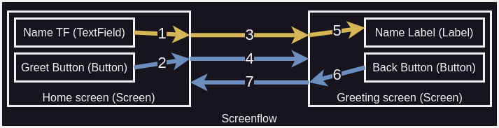
Now we can describe the flow of the application:
- The user enters his or her name in the Name TF, we also save this value on the Home screen directly.
- The user clicks the Greet Button, we also save this event on the Home screen directly.
- The Screenflow detects that the Home screen is ready to greet the user. It passes the name value from the Home screen to the Greeting screen.
- The Screenflow moves from the Home screen to the Greeting screen.
- The Name Label uses the name value that was passed to the Greeting screen.
- The user clicks the Back button, we also save this event on the Greeting screen directly.
- The Screenflow detects that the Greeting screen wants to go back to the Home screen. It moves to the screen accordingly.
As you can see we need to add intermediate values and events on the Screens directly. So the Screenflow can do its job 😉
Luckily this is very easy to do, and it looks very much like adding inputs and outputs to a Function:
- First enter the Screen Editor of the screen.
- Then proceed to the Spec&Doc Tab.
- To add a value you can add a Property.
- To add an event you can add an Event.
Try to do just that:
- On the Home screen: add a property called
nameof type String, also add an event calledon greet clicked. - On the Greeting screen: add a property called
nameof type String, also add an event calledon back clicked.
The following gif shows you the process:

We will speak more about properties and events in the coming chapters. Still I think that a quick introduction is needed.
What is a Property?
As for all the Visual Components we have seen so far, the property on the Screen achieve the exact same purpose. It gives a value to the Screen and then the screen choose what to do with it. It acts like an input for a Function. And that is exactly the case of the name property we added on the Greeting screen.
A property is however a bit more than a simple input. It cans also be an output! It takes a value from inside the Screen and then this value is passed to another screen. That is exactly the case of the name property we added on the Home screen 😉
What is an Event?
An event on the other hand is kind of a special property. It also has a type and a value, but we don't care about what they are exactly. All we want to know is when a new value is set, but for which reason? The purpose of an event is to tell us when a specific interaction occured. In our case we want to switch screens when the buttons are clicked.
If we take it the other way around: when I click Greet Button, I want the on greet clicked event on the Home screen to be triggered. We say that we trigger an event, a.k.a. we say that the event occured. We can see the event as a special kind of output.
We will see later that an event can also be seen and used as an input. But for now let's focus on the output side of it.
By convention the naming of event is always in the past tense, and it often begins with on. E.g.: on greet clicked means when the greet button has been clicked.
Buttons On Click
Now how do we know that the Greet Button has been clicked? As for the event we added on the screen, the Button component also has an event, and it is called On Click. Exactly what we need 😉
The events (or interactions) of a Visual Component is located in the Properties panel, in the 4th tab. For now when we click the button nothing is happening, let's change that by adding some logic shall we?
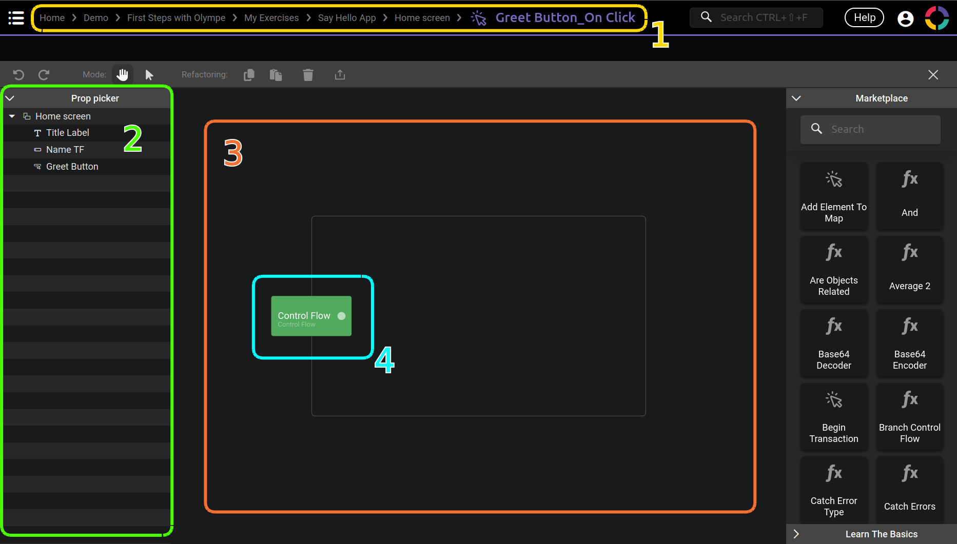
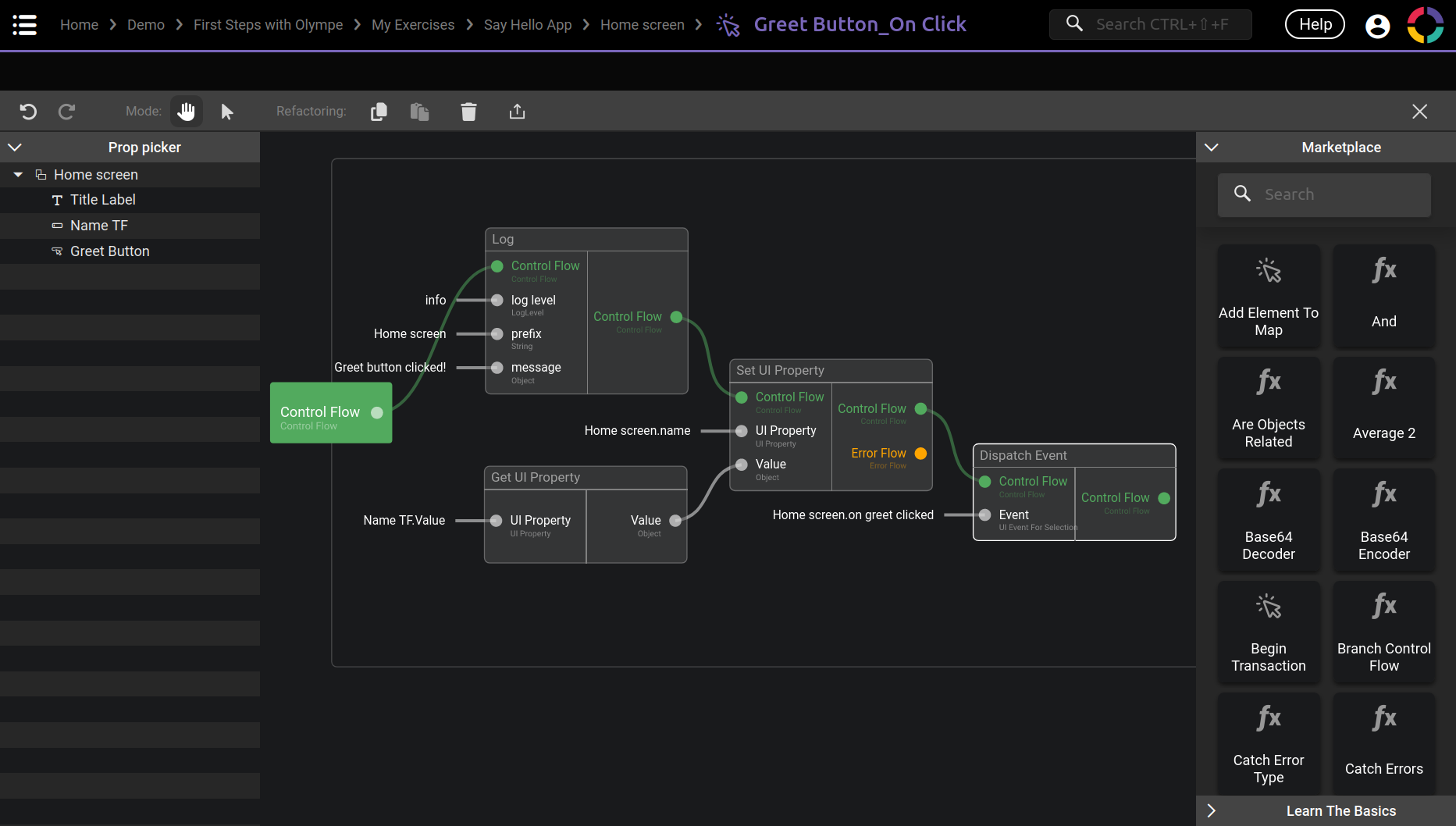
First of all we need to register a new action on the On Click event of the button, follow this gif:

This is what you should see:
It looks a lot like the Logic Tab of the Function Editor, and you are right about that. However there are quite some difference:
- Notice the breadcrumb location, we are in
Greet Button_On Clickin the Home screen. We effectively created an anonymous action. We will speak more about them later. - This is called the Prop Picker panel. It shows everything accessible by the button. The button being in the Home screen, we see everything in this screen. It is called a picker because it allows us to pick a property or an event on any components in the current screen. Remember how the screenflow only sees the screens but not what is inside? Here it is the contrary, we see everything that is inside the screen but not outside of it.
- This is the Logic Tab main area, it works exactly the same as for Function.
- Our newly created action has an unique input called
Control Flowof type Control Flow (in case it was not clear enough 😁). This is a special kind of input and we will speak about it.
This Control Flow input is the reason why I call this an Action and not a Function. We will see the difference between them in two chapters. For the moment let's just say that a Function with a Control Flow input (or output) is an Action 😉
Do you recall when I said that an event has a value and a type, but we don't really care what they are? This is it, this special type is Control Flow: we don't care about its value, all we want to know is when the flow is triggered. And when it is triggered we want to do something about it.
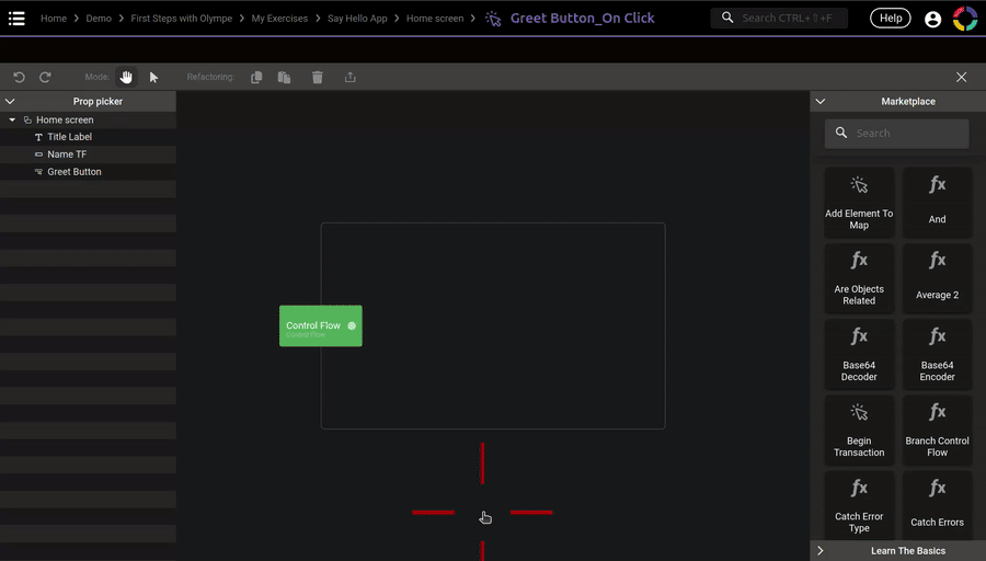
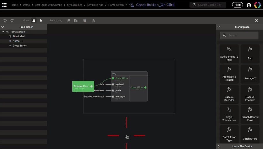
Maybe an example will make it more clear, let's add the brick Log from the Marketplace and test it out in the running tab (if you don't know how to open the console, search for it with your favorite search engine, it is different for each browser):
As you can see the Log brick is executed only when we click on the Greet Button.
In order, this is what is happening:
- The user clicks on the Greet Button.
- The
On Clickevent of the Button is triggered. - The
Greet Button_On Clickanonymous action is executed. - The input Control Flow is triggered.
- The flow then goes into the Log brick.
- The Log brick is executed.
Dispatch Event
Now that we know how to add logic to a Button On Click event.
How can we switch from one screen to another when we click the buttons?
Let's see again this schema:
In the previous section we only added the Log brick in the logic, thus we stayed in the Home screen only.
But what we need is actually the 2 arrow shown in the schema: when we click the button, we want to trigger the Home screen event that we created earlier: on greet clicked 😉
To achieve this Olympe provide a special brick called Dispatch Event, to create it we can use the Marketplace as usual, but there is a more convinient way with the Prop Picker.
A gif is worth a thousand words, I let you check it and reproduce the steps:
You should end up with this:
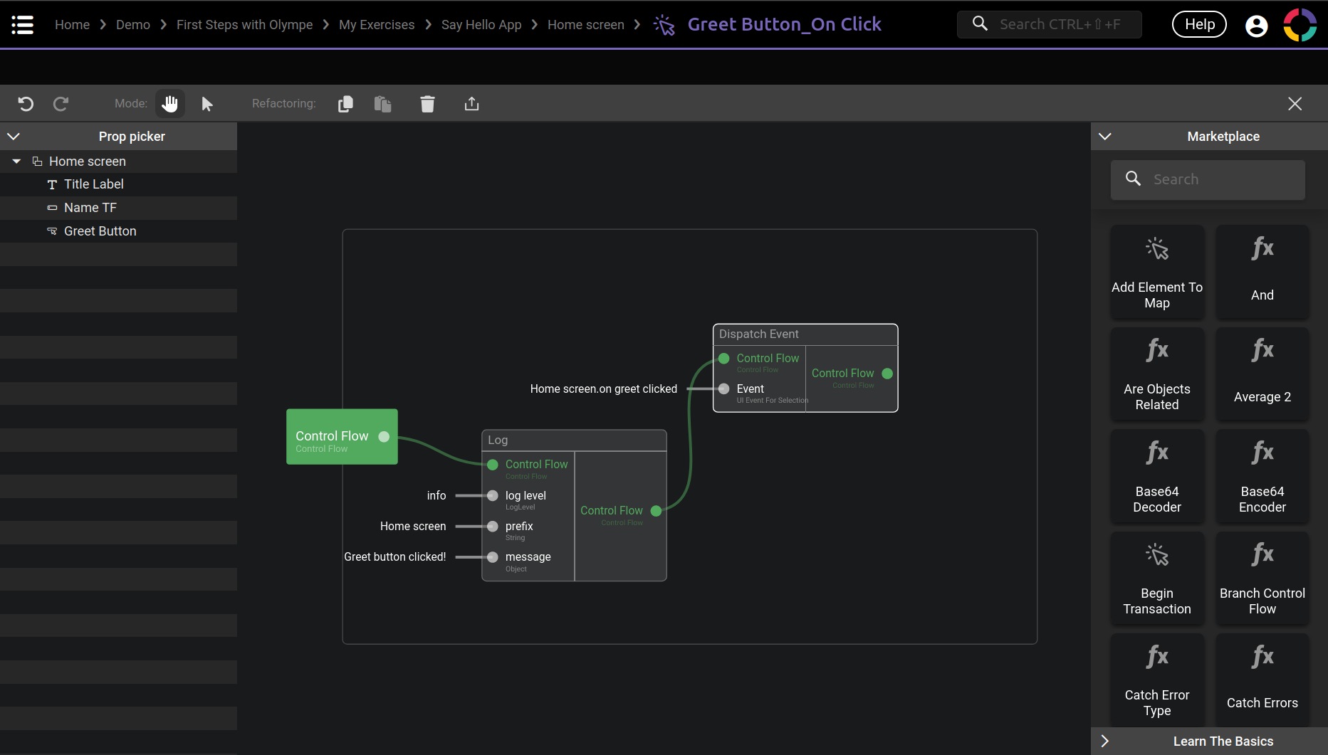
That's it! What we just did is: when the user click the greet button, the on greet clicked event of the screen is also triggered 🎉
The Prop Picker method is very useful because it is much faster to use than the Marketplace. It allows us to access any properties or events on a component in the current screen, from a logic point of view. We will use it more and more so don't worry if it is not clear yet.
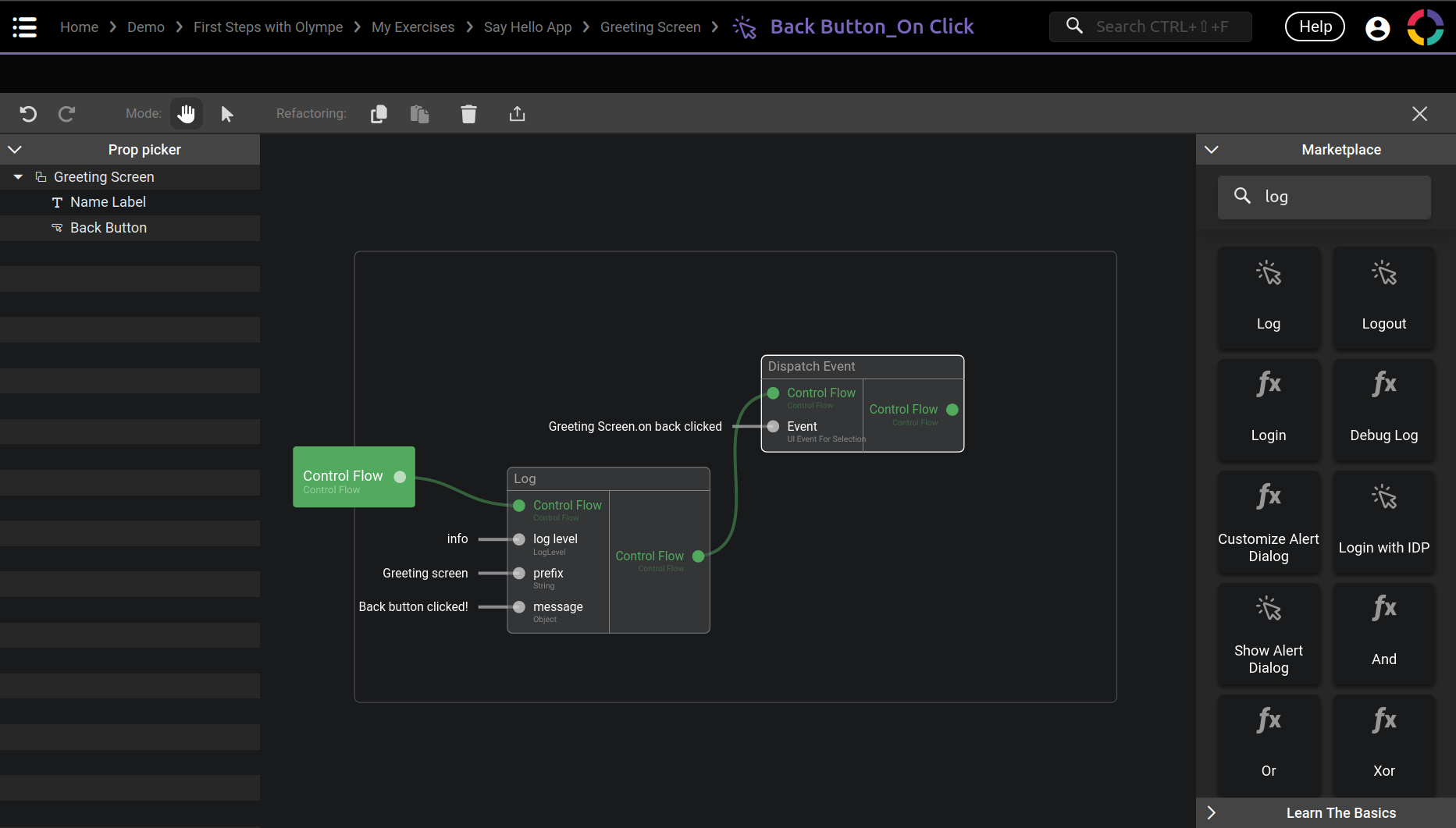
Little exercise now :evil: Reproduce what you just did for the Greet button but for the Back button in the other screen!
Solution
Switch from Screen to Screen
Let's check the schema again:
We just handled the 2 and 6 arrows by using the Dispatch Event brick.
The question now is how to do the 4 and 7 arrows?
If you remember what we talked about earlier this chapter, this is where the Screenflow comes into action!
To refresh our memory a little, the 3 button in this image allows us to create transitions between screens. That's exactly what we want 😉
Here again a gif should be better to see the steps required, I will explain them just after. The gif is a bit longer than usual so don't hesitate to check it multiple times, also notice how I use the running tab of the app to directly check if the transitions are working:

What are those steps?
- Click on the transition button on the screen that you want to leave (the from).
- Drag the arrow to the screen that you want to enter (the to).
- From here the transition is created! But it won't do much, we need to tell which event on the from screen will trigger the transition.
- On the newly created transition (the arrow), click on the middle dot. It will open the transition configuration.
- Under Event, click on None and select the event of the screen that should trigger the transition.
As you can see it is very easy and intuitive to create screens and transitions with the Screenflow.
It is really the backbone of any application, and Olympe really simplify this step for us!
Even if the Screenflow is great for creating the backbone of an application. It can become quite complex and loose its simplicity when the application is itself complex (lots of screens and transitions). In those cases Olympe provide another solution called Routing. We will explore it later on 😉
Passing Values
We're almost done 🎉
All the blue arrows are done, all that's left to do are the yellow ones (1, 3 and 5):
Let's start with the 1 arrow: we need to make the Name TF value go up in the Home screen property name that we created earlier.
To do this we will use the Prop Picker again. We won't access the event this time, but we will access the properties. To be more precise:
- We will get the Value property of the Name TF.
- We will set the name property of the Home screen.
Those actions with the Prop Picker will create two new bricks that we will use a lot: Get UI Property and Set UI Property.
I let you check the gif and reproduce it, the steps are almost the same as for the Dispatch Event:
This is what you should end up with:
Those were the steps for the 1 arrow, now let's see the 3 arrow: passing the name property value of the Home screen to the name property of the Greeting screen.
Again this is the responsability of the Screenflow, the process is quite simple:
Resume: Screen Transition
Now is a good time to resume all we learnt about the transitions:

- The arrow shows the direction of the transition, effectively showing the from screen and the to screen. The middle dot allows to open the transition configuration.
- In our case we are going from the Home screen to the Greeting screen.
- The Event part says which event on the from screen will trigger the transition to the to screen.
- In our case the event is on greet clicked of the Home screen.
- The Property Mapping part is for passing values from the from screen to the to screen.
- In our case we are passing the name property value of the Home screen to the name property of the Greeting screen.
- Lastly there is a delete button to, well, delete the transition.
Dynamic Label
I promise this is the last time we see this schema 😉
The only missing arrow is 5: putting the name property value of the Greeting screen into the Text property of the Name Label.
Indeed right now the label always shows "Hello TODO", let's change that and make our label dynamic!
As for the On Click event of the button on which we added some logic. We can make any property dynamic by assigning it some logic!
To do that we will click on the Fx button on the right of the property. I let you check the gif and reproduce it:
In the gif I reuse the Say Hello brick that we created in the last chapter. If you are in a different project you won't be able to access it. In that case you can either recreate it or use the Concat brick directly.
Here is the final logic:
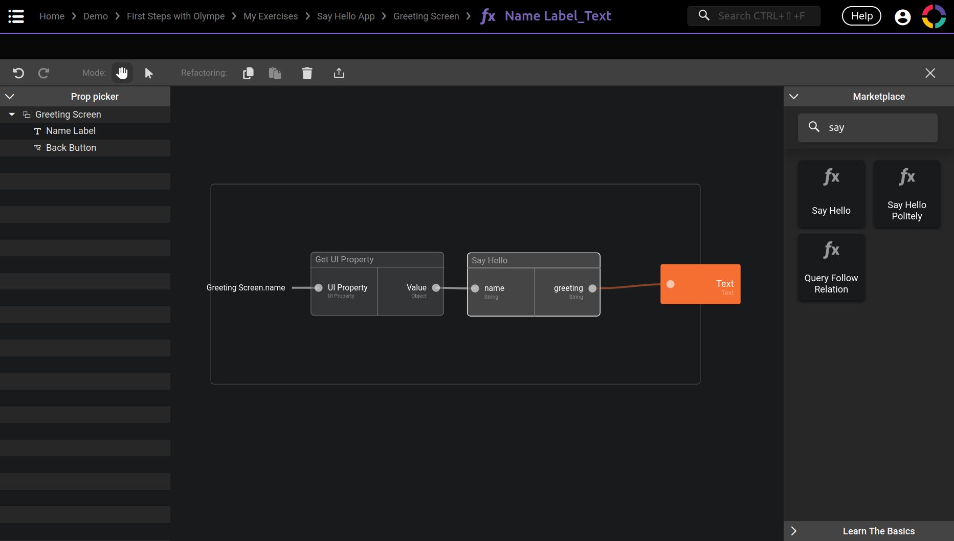
This is what is happening:
- We use Get UI Property to get the name property value of the screen.
- We input this value in the Say Hello brick (which itself does a Concat of
"Hello "with thenameinput). - The output is then assigned to the Text property of the Name Label!
Conclusion
Congrats! You just finished a brand new application 😃
How does it feel? Sit back and relax, this was a long chapter!
We explored quite a few new concepts:
- The UI App with its Screenflow and the Screen in it.
- The Label, Button and TextField components.
- The Property Panel and how to use it.
- How to use the Screenflow to create the backbone of the application.
- We also mixed for the first time the UI with the Logic 😉
In the next chapter we will dive a little deeper in the UI world by creating our own Visual Component!
The remaining of this chapter are a little bonus exercise for our Say Hello App, and also the next new steps for our bigger project: Guess the Number!
Bonus Exercise: Disable the Button
The application in its current state has a little flaw, if the user do not enter its name and click the Greet! button, the Greeting screen will just show "Hello".
While this is fine, it would also be cool to only allow the user to click the button when a name is entered!
As for any exercise, try it by yourself and if you are stuck you can check the hints and then the solution 😉
Hints:
Dynamic Button (enabled/disabled)
- To disable a Button the property that you need is
Disabled. - This is a dynamic behavior, thus you need to use the Fx button.
- You will need to use the Prop Picker to get the value of the TextField (or use Get UI Property directly).
- The brick to check if a String is empty is called Is String Empty.
Solution:
Dynamic Button (enabled/disabled)
Practice Project
As usual we finish the chapter by adding to our project what we just learnt!
If you didn't do this part in the last chapter, you should start by it first 😉
The goal for this chapter is to:
- Create the UI App, call it Guess the Number.
- Create the Screens in it with their properties and events, more about it just below.
- Use the Screenflow Tab to create the transitions between the screens.
For a change I will show you the final Screenflow and what needed in it:
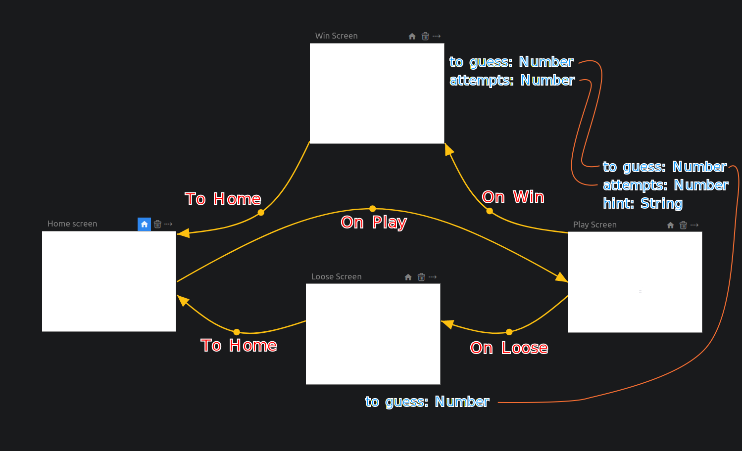
I hope it is readable, here is how to read it:
- You will need to add 3 additional screens.
- In blue you can see the properties (the type is after the colon
:).- Please add default value for each, any value is OK.
- In red you can see the events.
- After creating the properties and events, you can set up the transitions as shown.
- The orange thiner lines show the Property Mapping to be done for each transition.
There is no gif showing the solution this time, it would be too long for a gif.
If you have any doubt don't hesitate to read again the section, there is no rush.
That's it for now, it will serve as the backbone of our little game 😉
We will fill the screens in the next chapter!
I hope I will see you there 😃